Prophet#

Introduction#
In this lecture we will learn about Prophet, a framework for forecasting time series developed by Meta (former Facebook) in 2017.
Prophet is based on an additive model where non-linear trends are fit with yearly, weekly, and daily seasonality, plus holiday effects.
It works best with time series that have strong seasonal effects and several seasons of historical data.
Prophet is robust to missing data, shifts in the trend, and typically handles outliers well.
In the following, we will cover:
The main components of the Prophet model: trend, seasonality, and holidays.
How to use the prophet library in Python to perform time series forecasting.
Try more advanced options and configurations available within the Python library.
Model components#
Prophet models a time series \(y(t)\) as a combination of three components:
trend \(g(t)\),
seasonality \(s(t)\),
holidays \(h(t)\).
The model equation is:
where \(\epsilon_t\) is the error term assumed to be normally distributed.
Trend component \(g(t)\)#
The trend component models non-periodic changes in the value of the time series.
Prophet provides two options for modeling the trend:
Piece-wise linear growth model.
Logistic growth model.
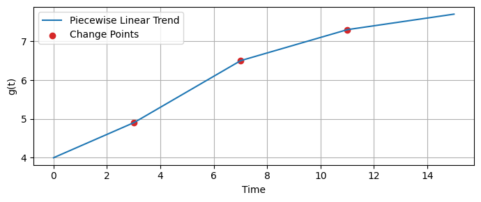
Piece-wise linear growth model#
A piece-wise linear function can accommodate changes in the trend’s direction over time.
This is particularly useful for time series data exhibiting shifts in growth rates due to external factors or internal changes.
This allows to capture and forecast time series trends that do not follow a specific form (linear or logistic).
In a piece-wise linear trend model, the time series is divided into segments.
In each segment, the trend is modeled as a linear function.
The points where the trend changes direction are called change points.
Prophet allows users to specify the maximum number of potential change points or to let the algorithm automatically estimate it based on the data.
Prophet automatically detects the change points, allowing the trend to adjust its slope at these points, hence capturing shifts in the trend’s direction.
Users can adjust the flexibility of the model in capturing trend changes by tuning the change point prior scale parameter.
A higher prior scale makes the model more sensitive to changes (allowing more flexibility).
A lower prior scale makes the model less sensitive to fluctuations (resulting in a smoother trend).
The piece-wise linear trend model in Prophet is defined as:
where:
\(g(t)\) is the trend component at time \(t\),
\(k\) is the initial growth rate,
\(a(t)\) is time since the corresponding change point if \(t\) is after a change point, or 0 otherwise,
\(\delta\) represents adjustments to the growth rate at each change point,
\(g_0\) is the offset (intercept), i.e., the value at \(t=0\),
\(\gamma\) smooths the trend at each change point.
def compute_a(t, change_points):
    #return np.array([max(0, t - cp) for cp in change_points])
    return np.array([np.heaviside(t - cp, 1) for cp in change_points])

def compute_g(t, k, delta, g0, gamma, change_points):
    a_t = compute_a(t, change_points)
    trend = (k + np.dot(a_t, delta)) * t + (g0 + np.dot(a_t, gamma))
    return trend
change_points = [3, 7, 11]             # Times at which changes occur
k = 0.3                                # Initial growth rate
delta = np.array([0.1, -0.2, -0.1])    # Adjustments to growth rate
g0 = 4.0                               # Initial offset
gamma = -delta*np.array(change_points) # Compensations for discontinuities

time_points = np.linspace(0, 15, 200)
g_values = [compute_g(t, k, delta, g0, gamma, change_points) for t in time_points]
🛠️ Try it yourself
Try modifying the parameters
change_points,k,delta,g0, andgammato see how piece-wise linear trend above change.
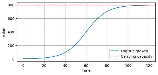
Logistic growth model#
The Logistic growth model is used to describe a population that:
Grows rapidly when it’s small.
Grows slowlier as it approaches a maximum limit (carrying capacity) that it cannot exceed.
Eventually levels off when the carrying capacity is reached (saturating growth).
Carrying capacity
Is a concept borrowed from population biology.
It refers to the maximum population size that an environment can sustain without being degraded.
For business metrics, this could represent a market saturation point, such as the maximum number of users a platform can support due to limitations in infrastructure or market size.
Saturating growth
It refers to a growth pattern where increments become progressively smaller as the value approaches the carrying capacity.
When the values are far below the carrying capacity, growth can be rapid (there is a lot of “room” to grow).
As the values approach the carrying capacity, the growth rate decreases, and the time series levels off, reflecting a saturation point where further growth becomes increasingly difficult.
The formula describing the Logistic trend is:
where:
\(k\) is the growth rate,
\(C\) is the carrying capacity (the maximum achievable value),
\(t\) is time,
\(m\) is the point in time where growth is halfway to the carrying capacity.
def logistic_growth(t, C, k, m):
    return C / (1 + np.exp(-k * (t - m)))

# Parameters
C = 800   # carrying capacity
k = 0.1   # growth rate
m = 60    # offset parameter, indicating the inflection point

t = np.linspace(0, 120, 200)
y = logistic_growth(t, C, k, m)
🛠️ Try it yourself**
Try setting
m=20to see how the curve changes.Try also modifying the values of
kandC.
Seasonality component \(s(t)\)#
The seasonality component \(s(t)\) models periodic changes, which can be yearly, weekly, or daily.
Prophet uses Fourier series to model these periodic changes, allowing for flexibility in capturing seasonality.
Seasonality \(s(t)\) is defined as:
where:
\(N\) is the number of Fourier terms (higher \(N\) captures more detailed seasonal patterns),
\(P\) is the period (e.g., 365.25 for yearly seasonality),
\(a_n\) and \(b_n\) are the Fourier series coefficients that are fitted to the data.
Holidays and events \(h(t)\)#
The holiday component \(h(t)\) models irregular - but predictable - events.
This component is represented as a series of indicator functions that equal 1 if the time \(t\) corresponds to a holiday and 0 otherwise.
Coefficients associated with these indicators are fitted to measure the impact of holidays on the forecast.
The holiday component \(h(t)\) is defined as
where:
\(D_i\) represents the set of times corresponding to holiday \(i\),
\(I\) is an indicator function,
\(\delta_i\) is the effect of holiday \(i\) on the time series, which can be tuned.
Seasonal and holiday effects adjustment#
Like for piece-wise linear trend, Prophet can adjust for overfitting or underfitting of seasonal and holiday effects by changing a prior scale parameter.
A larger prior scale allows the model to fit larger seasonal fluctuations.
A smaller scale regularizes the model, preventing it from overfitting seasonal and holiday effects.
Fitting the Model#
The components described above are combined into the overall model.
To fit the Prophet model to historical data the model’s parameters are estimated using maximum likelihood estimation or Bayesian sampling.
This involves optimizing the parameters to minimize the difference between the observed and predicted values of the time series.
The optimization is usually done through gradient descent methods.
To perform the optimization Prophet relies on Stan, a C++ library for statistical modeling and high-performance statistical computation that makes model fitting very fast.
Prophet in Python#
The input to Prophet is always a dataframe with two columns:
dsandy.Be sure to rename your dataframe with these column names.
The
ds(datestamp) column should be of a format expected by Pandas, ideally YYYY-MM-DD for a date or YYYY-MM-DD HH:MM:SS for a timestamp.The
ycolumn must be numeric, and represents the measurement we wish to forecast.
As an example, we’ll look at a time series of daily page views for the Wikipedia page of Peyton Manning, a former football player.
This is a nice example because it illustrates some of Prophet’s features, like multiple seasonality, changing growth rates, and the ability to model special days (such as Manning’s playoff and superbowl appearances).
data_path = 'https://raw.githubusercontent.com/PinkWink/DataScience/master/data/07.%20example_wp_peyton_manning.csv'
peyton = pd.read_csv(data_path)
peyton.head()
| ds | y | |
|---|---|---|
| 0 | 2007-12-10 | 14629 |
| 1 | 2007-12-11 | 5012 |
| 2 | 2007-12-12 | 3582 |
| 3 | 2007-12-13 | 3205 |
| 4 | 2007-12-14 | 2680 |
peyton.plot(figsize=(14, 4), grid=True);
Since there are big spikes in the data, we will apply a logarithm transformation to obtain a more even range of variation in the data.
peyton['y'] = np.log(peyton['y'])
peyton.head()
| ds | y | |
|---|---|---|
| 0 | 2007-12-10 | 9.590761 |
| 1 | 2007-12-11 | 8.519590 |
| 2 | 2007-12-12 | 8.183677 |
| 3 | 2007-12-13 | 8.072467 |
| 4 | 2007-12-14 | 7.893572 |
The log transformation clearly stabilized the variance in the data, as we can see from the plot.
peyton.plot(figsize=(14, 4), grid=True);
Next, we instantiate a new Prophet object.
We can specify several parameters such as:
growth='linear', meaning that we use a piece-wise linear function to model the trend. Other options are'logistic'or'flat'to specify a logistic or flat trend, respectively.seasonality_mode='additive'. The other option is'multiplicative'.interval_width=0.90specifies the width of the prediction intervals for the forecast.
model = Prophet(growth='linear', seasonality_mode='additive', interval_width=0.90)
Once the model is instantiated, we call its fit method and pass to it the historical dataframe.
Fitting should take 1-2 seconds.
model.fit(peyton);
14:28:49 - cmdstanpy - INFO - Chain [1] start processing
14:28:49 - cmdstanpy - INFO - Chain [1] done processing
Predictions are then made on a dataframe with a column
dscontaining the dates for which a prediction is to be made.You can get a suitable dataframe that extends into the future a specified number of days using the helper method
Prophet.make_future_dataframe.periods=365specifies the length of our forecast.freq='D'specifies that the units (365in this case) represent days.By setting
include_history=Trueit will also include the dates used for training, so we can also see the model.
future = model.make_future_dataframe(periods=365, freq='D', include_history=True)
future.tail()
| ds | |
|---|---|
| 3265 | 2017-01-15 |
| 3266 | 2017-01-16 |
| 3267 | 2017-01-17 |
| 3268 | 2017-01-18 |
| 3269 | 2017-01-19 |
The
predictmethod will assign each row infuturea predicted valueyhat.By giving also historical dates (
include_history=True), it will provide an in-sample fit.The
forecastobject here is a new dataframe that includes a columnyhatwith the forecast and many other columns, including those with uncertainty intervals.
forecast = model.predict(future)
forecast.tail()
| ds | trend | yhat_lower | yhat_upper | trend_lower | trend_upper | additive_terms | additive_terms_lower | additive_terms_upper | weekly | weekly_lower | weekly_upper | yearly | yearly_lower | yearly_upper | multiplicative_terms | multiplicative_terms_lower | multiplicative_terms_upper | yhat | |
|---|---|---|---|---|---|---|---|---|---|---|---|---|---|---|---|---|---|---|---|
| 3265 | 2017-01-15 | 7.183832 | 7.266607 | 9.181754 | 6.693636 | 7.701008 | 1.018137 | 1.018137 | 1.018137 | 0.048286 | 0.048286 | 0.048286 | 0.969851 | 0.969851 | 0.969851 | 0.0 | 0.0 | 0.0 | 8.201969 |
| 3266 | 2017-01-16 | 7.182798 | 7.584725 | 9.486245 | 6.691056 | 7.701466 | 1.344165 | 1.344165 | 1.344165 | 0.352294 | 0.352294 | 0.352294 | 0.991871 | 0.991871 | 0.991871 | 0.0 | 0.0 | 0.0 | 8.526964 |
| 3267 | 2017-01-17 | 7.181765 | 7.335165 | 9.306341 | 6.688476 | 7.701924 | 1.132587 | 1.132587 | 1.132587 | 0.119640 | 0.119640 | 0.119640 | 1.012947 | 1.012947 | 1.012947 | 0.0 | 0.0 | 0.0 | 8.314352 |
| 3268 | 2017-01-18 | 7.180731 | 7.264317 | 9.103641 | 6.685896 | 7.702848 | 0.966217 | 0.966217 | 0.966217 | -0.066659 | -0.066659 | -0.066659 | 1.032875 | 1.032875 | 1.032875 | 0.0 | 0.0 | 0.0 | 8.146948 |
| 3269 | 2017-01-19 | 7.179697 | 7.248752 | 9.150766 | 6.683316 | 7.704067 | 0.979145 | 0.979145 | 0.979145 | -0.072266 | -0.072266 | -0.072266 | 1.051411 | 1.051411 | 1.051411 | 0.0 | 0.0 | 0.0 | 8.158842 |
You can plot the forecast by calling the
Prophet.plotmethod and passing in theforecastdataframe.
fig1 = model.plot(forecast, figsize=(14, 4))
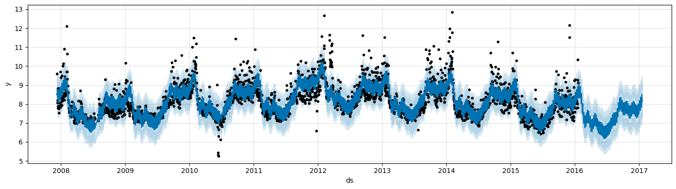
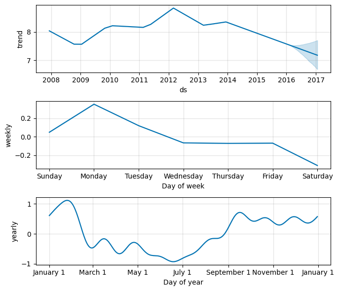
If you want to see the forecast components, you can use the
Prophet.plot_componentsmethod.By default you’ll see the trend, yearly seasonality, and weekly seasonality of the time series.
If you include holidays, you’ll see those here, too.
fig2 = model.plot_components(forecast, figsize=(7, 6))
An interactive figure of the forecast and components can be created with plotly:
from prophet.plot import plot_plotly, plot_components_plotly

plot_plotly(model, forecast)
plot_components_plotly(model, forecast)
Modeling holidays and special events#
If you have holidays or other recurring events that you’d like to model, you must create a dataframe for them.
It has two columns (
holidayandds) and a row for each occurrence of the holiday.It must include all occurrences of the holiday, both in the past (back as far as the historical data go) and in the future (out as far as the forecast is being made).
If they won’t repeat in the future, Prophet will model them and then not include them in the forecast.
You can also include columns
lower_windowandupper_windowwhich extend the holiday out to [lower_window,upper_window] days around the date.For instance, if you wanted to include Christmas Eve in addition to Christmas you’d include
'lower_window': -1and'upper_window': 0.
Here we create a dataframe that includes the dates of all of Peyton Manning’s playoff appearances:
# add holidays
playoffs = pd.DataFrame({
  'holiday': 'playoff',
  'ds': pd.to_datetime(['2008-01-13', '2009-01-03', '2010-01-16',
                        '2010-01-24', '2010-02-07', '2011-01-08',
                        '2013-01-12', '2014-01-12', '2014-01-19',
                        '2014-02-02', '2015-01-11', '2016-01-17',
                        '2016-01-24', '2016-02-07']),
  'lower_window': 0, # this specifies spillover into previous days
  'upper_window': 1, # this for the future days
})

superbowls = pd.DataFrame({
  'holiday': 'superbowl',
  'ds': pd.to_datetime(['2010-02-07', '2014-02-02', '2016-02-07']),
  'lower_window': 0,
  'upper_window': 1,
})

holidays_df = pd.concat((playoffs, superbowls))
Above we have included the superbowl days as both playoff games and superbowl games.
This means that the superbowl effect will be an additional additive bonus on top of the playoff effect.
Once holidays_df is created, holiday effects are included in the forecast by passing them in with the holidays argument of the constructor.
# fit and predict
model_holyday = Prophet(holidays=holidays_df, # this includes the holidays
                        growth='linear', seasonality_mode='additive', interval_width=0.90) # these are unchanged
forecast = model_holyday.fit(peyton).predict(future)
14:28:50 - cmdstanpy - INFO - Chain [1] start processing
14:28:51 - cmdstanpy - INFO - Chain [1] done processing
We can see the effects of various holidays on site visits.
forecast[(forecast['playoff'] + forecast['superbowl']).abs() > 0][
        ['ds', 'yhat', 'playoff', 'superbowl']][-10:]
| ds | yhat | playoff | superbowl | |
|---|---|---|---|---|
| 2190 | 2014-02-02 | 11.633831 | 1.224747 | 1.200293 |
| 2191 | 2014-02-03 | 12.848671 | 1.902340 | 1.461554 |
| 2532 | 2015-01-11 | 9.886680 | 1.224747 | 0.000000 |
| 2533 | 2015-01-12 | 10.896298 | 1.902340 | 0.000000 |
| 2901 | 2016-01-17 | 9.643653 | 1.224747 | 0.000000 |
| 2902 | 2016-01-18 | 10.656033 | 1.902340 | 0.000000 |
| 2908 | 2016-01-24 | 9.779940 | 1.224747 | 0.000000 |
| 2909 | 2016-01-25 | 10.782914 | 1.902340 | 0.000000 |
| 2922 | 2016-02-07 | 10.697970 | 1.224747 | 1.200293 |
| 2923 | 2016-02-08 | 11.886316 | 1.902340 | 1.461554 |
We can also check visually the impact of the holidays.
fig2 = model_holyday.plot_components(forecast, figsize=(7, 6))
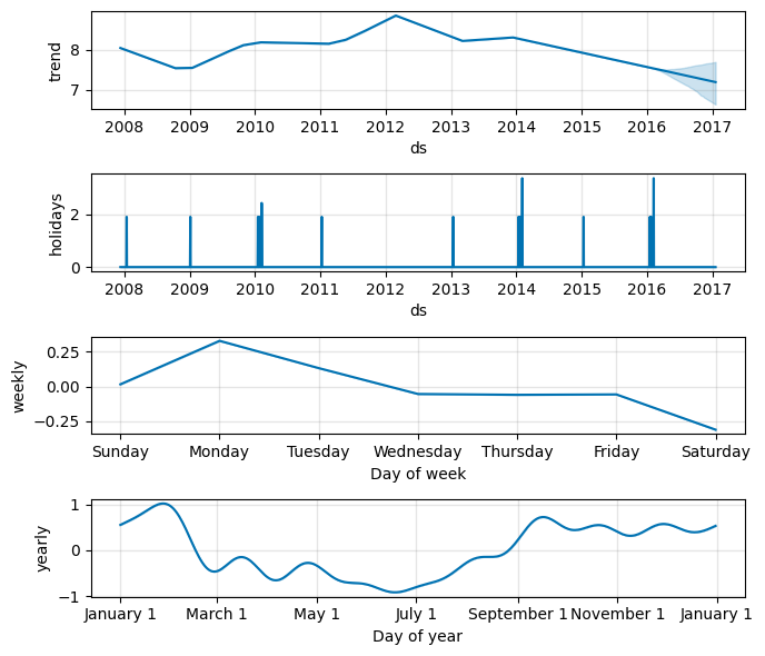
Now
plot_componentscontains also the holidays component.Peyton won the Superbowl in 2016 while losing in 2010 and 2014.
We can see these spikes in the holidays chart.
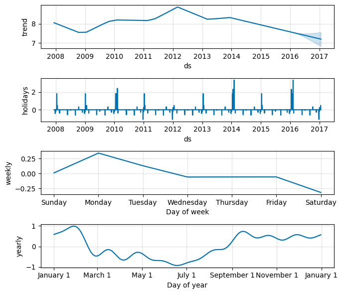
You can use a built-in collection of country-specific holidays using the
add_country_holidays.The name of the country is specified, and then major holidays for that country will be included in addition to any holidays that are specified via the holidays argument described before.
A list of available countries and the country code is availble here.
model_holyday2 = Prophet(holidays=holidays_df) # this includes the holidays we specified by hand
model_holyday2.add_country_holidays(country_name='US') # this the country-specific holidays
model_holyday2.fit(peyton)
print(model_holyday2.train_holiday_names)
14:28:52 - cmdstanpy - INFO - Chain [1] start processing
14:28:53 - cmdstanpy - INFO - Chain [1] done processing
0                         playoff
1                       superbowl
2                  New Year's Day
3                    Memorial Day
4                Independence Day
5                       Labor Day
6                Thanksgiving Day
7                   Christmas Day
8        Christmas Day (observed)
9      Martin Luther King Jr. Day
10          Washington's Birthday
11                   Columbus Day
12                   Veterans Day
13        Veterans Day (observed)
14    Independence Day (observed)
15      New Year's Day (observed)
dtype: str
As before, the country-level holidays will then show up in the components plot.
forecast = model_holyday2.predict(future)
fig = model_holyday2.plot_components(forecast, figsize=(7, 6))
Saturating forecasts#
As discussed previously, Prophet allows you to make forecasts using a logistic growth trend model.
Here, we will use a time series from the Datasets Package from
statsmodels.The list of available datasets is here.
We need to do a bit of data preproccesing before using the data.
co2 = sm.datasets.get_rdataset("CO2", "datasets").data
print(co2.head())
          time   value
0  1959.000000  315.42
1  1959.083333  316.31
2  1959.166667  316.50
3  1959.250000  317.56
4  1959.333333  318.13
# Convert decimal year to pandas datetime
def convert_decimal_year_to_datetime(decimal_years):
    dates = [(pd.to_datetime(f'{int(year)}-01-01') + pd.to_timedelta((year - int(year)) * 365.25, unit='D')).date()
             for year in decimal_years]
    return dates

# Convert to Prophet format
co2['time'] = convert_decimal_year_to_datetime(co2['time'])
co2.rename(columns={'time': 'ds', 'value': 'y'}, inplace=True)

# Convert the column ds to datetime
co2['ds'] = pd.to_datetime(co2['ds'])
print("\nConverted:\n------------------\n", co2.head())
Converted:
------------------
           ds       y
0 1959-01-01  315.42
1 1959-01-31  316.31
2 1959-03-02  316.50
3 1959-04-02  317.56
4 1959-05-02  318.13
# Resample to monthly frequency based on the ds column
co2 = co2.resample('MS', on='ds').mean().reset_index()

# Replace NaN with the mean of the previous and next value
co2['y'] = co2['y'].interpolate()
print("\nResampled:\n------------------\n", co2.head())
Resampled:
------------------
           ds         y
0 1959-01-01  315.8650
1 1959-02-01  316.1825
2 1959-03-01  316.5000
3 1959-04-01  317.5600
4 1959-05-01  318.1300
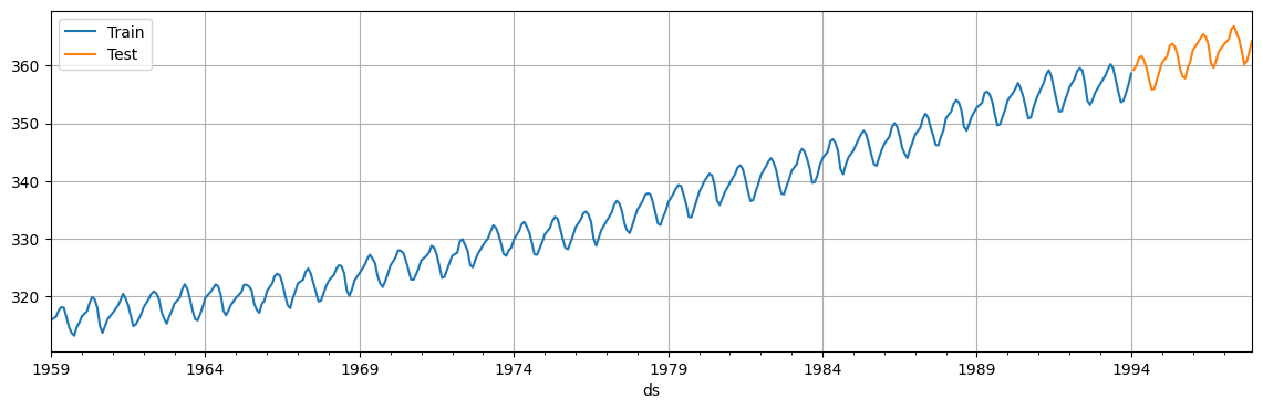
Next, we split the data in training set (first 90% of the data) and test set (remaining 10%).
# Note that we need to make a copy here since we will modify the data
train = co2.iloc[:int(co2.shape[0] * 0.9)].copy()
test = co2.iloc[int(co2.shape[0] * 0.9):].copy()

fig, ax = plt.subplots(figsize=(10, 4))
train.plot(x='ds', y='y', figsize=(14, 4), grid=True, ax=ax, label='Train')
test.plot(x='ds', y='y', figsize=(14, 4), grid=True, ax=ax, label='Test')
plt.legend()
plt.show()
The logistic model requires to specify a carrying capacity, i.e., the maximum achievable point (total market size, total population size, etc..).
The carrying capacity is specified in a column
cap.Here we will set an arbitrary value, but this would normally be set based on expertise and knowledge about the data.
train['cap'] = 360
We then fit the model as before, except we change growth='linear' into growth='logistic'.
model_logist = Prophet(growth='logistic', # this has changed
                       seasonality_mode='additive', interval_width=0.90)
model_logist.fit(train);
14:28:54 - cmdstanpy - INFO - Chain [1] start processing
14:28:55 - cmdstanpy - INFO - Chain [1] done processing
We make a dataframe for future predictions as before, except we must also specify the capacity in the future.
Here we set the capacity at the same value we used for historical data (
train['cap'] = 360).Finally, we compute the forecast for the dates in the test set.
future = future = pd.DataFrame({'ds': pd.concat([train['ds'], test['ds']])}) # Init df for predictions
future['cap'] = 360                                                          # Set the cap
fcst = model_logist.predict(future)                                          # Compute forecasts
fig, ax = plt.subplots(figsize=(14, 4))
fig = model_logist.plot(fcst, ax=ax)
ax.plot(test['ds'], test['y'], 'tab:red', marker='o', markersize=3, alpha=0.5);
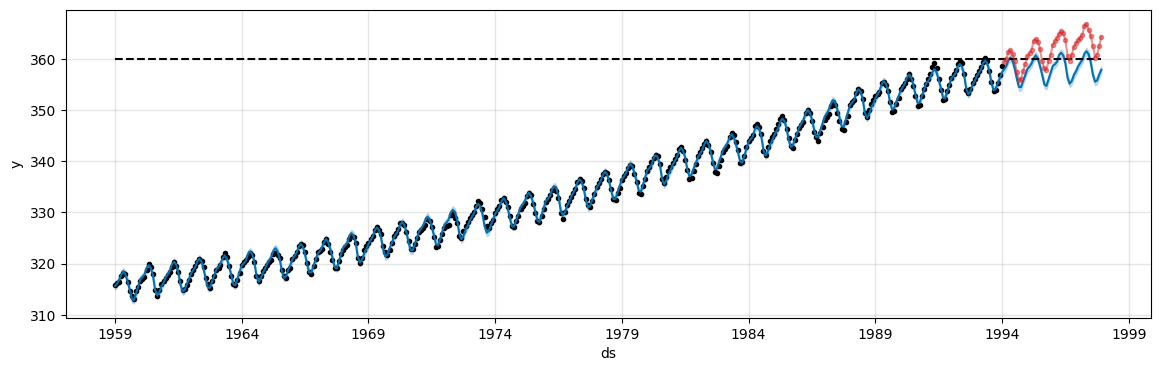
The model tries to keep the predictions under the specified
capvalue.The value is clearly too low in this case. Try with
cap=380to get better predictions.
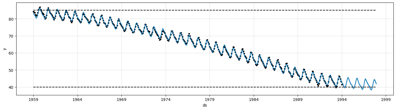
The logistic growth model can also handle a saturating minimum.
This is specified with a column
floorin the same way as thecapcolumn specifies the maximum.To use a logistic growth trend with a saturating minimum, a maximum capacity must also be specified.
train['y'] = 400 - train['y'] # Modify the data so that the time series decreases over time
train['cap'] = 85
train['floor'] = 40
future['cap'] = 85
future['floor'] = 40
m = Prophet(growth='logistic')
m.fit(train)
fcst = m.predict(future)
fig = m.plot(fcst, figsize=(14, 4))
14:28:55 - cmdstanpy - INFO - Chain [1] start processing
14:28:55 - cmdstanpy - INFO - Chain [1] done processing
Trend changepoints#
Real time series frequently have abrupt changes in their trajectories.
By default, Prophet will automatically detect these changepoints and will allow the trend to adapt appropriately.
However, if you wish to have finer control over this process (e.g., Prophet missed a rate change, or is overfitting rate changes in the history), then there are several input arguments you can use.
Prophet detects changepoints by first specifying a large number of potential changepoints at which the rate is allowed to change.
Through a L1 regularization that encourages sparsity, it use as few of them as possible.
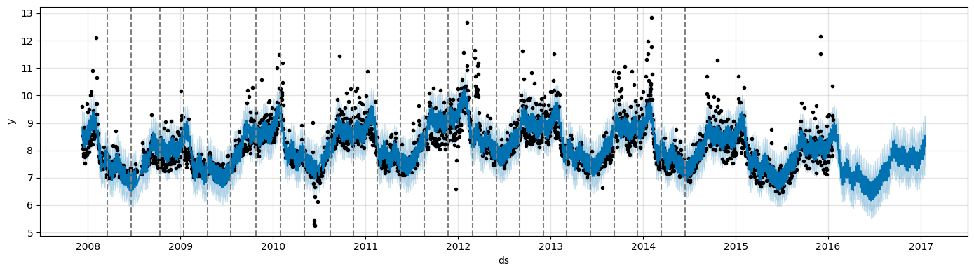
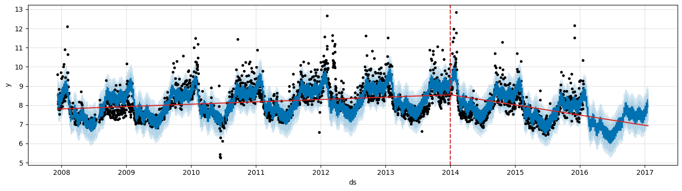
Let’s consider again the Peyton Manning data.
# Data already log-transformed
df = pd.read_csv('https://raw.githubusercontent.com/facebook/prophet/main/examples/example_wp_log_peyton_manning.csv')
m = Prophet()
m.fit(df)
future = m.make_future_dataframe(periods=365)
forecast = m.predict(future)
14:28:56 - cmdstanpy - INFO - Chain [1] start processing
14:28:56 - cmdstanpy - INFO - Chain [1] done processing
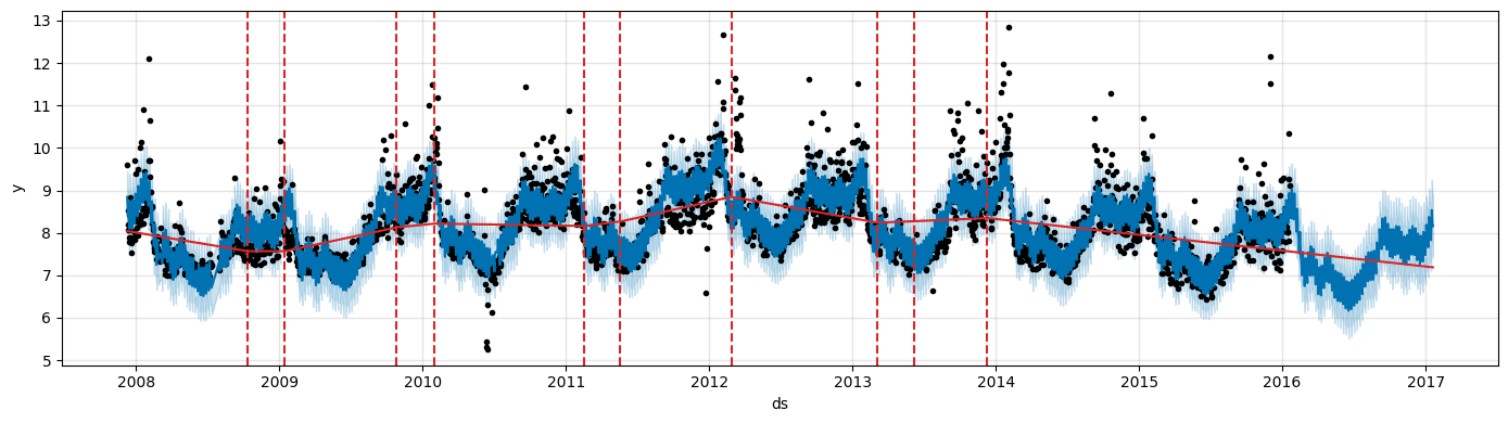
Prophet specifies 25 potential changepoints which are uniformly placed in the first 80% of the time series.
The vertical lines indicate where the potential changepoints were placed.
from prophet.plot import add_changepoints_to_plot
fig = m.plot(forecast, figsize=(14, 4))
a = add_changepoints_to_plot(fig.gca(), m, forecast, threshold=0.0, cp_color='gray', trend=False)
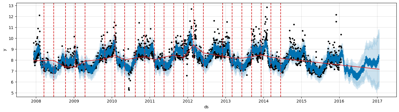
Even though we have a lot of places where the rate can possibly change, because of the sparse prior, most of these changepoints are not used.
We can see this by plotting the magnitude of the rate change at each changepoint.
We keep only those where the magnitude of the rate change is significant.
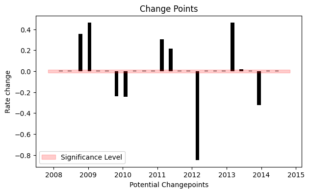
Only 9 out of 25 potential changepoints are actually kept.
We can visualize them on the actual data.
fig = m.plot(forecast, figsize=(14, 4))
a = add_changepoints_to_plot(fig.gca(), m, forecast, threshold=0.01, cp_color='tab:red', trend=True)
By default changepoints are only inferred for the first 80% of the time series.
This allows having plenty of runway for projecting the trend forward and to avoid overfitting fluctuations at the end of the time series.
This default works in many situations but not all, and can be changed using the
changepoint_rangeargument.For example,
m = Prophet(changepoint_range=0.9)will place potential changepoints in the first 90% of the time series.This can be useful in situation where there are important changes in the trend towards the end of the time series.
Adjusting trend flexibility#
If the trend changes are being overfit (too much flexibility) or underfit (not enough flexibility), you can adjust the strength of the sparsity prior using the input argument
changepoint_prior_scale.By default, this parameter is set to 0.05.
Increasing it will make the trend more flexible.
m = Prophet(changepoint_prior_scale=0.5) # Increase prior
forecast = m.fit(df).predict(future)
fig = m.plot(forecast, figsize=(14, 4))
a = add_changepoints_to_plot(fig.gca(), m, forecast, threshold=0.01, cp_color='tab:red', trend=True)
14:28:57 - cmdstanpy - INFO - Chain [1] start processing
14:28:58 - cmdstanpy - INFO - Chain [1] done processing
Decreasing it will make the trend less flexible.
m = Prophet(changepoint_prior_scale=0.001) # Decrease prior
forecast = m.fit(df).predict(future)
fig = m.plot(forecast, figsize=(14, 4))
a = add_changepoints_to_plot(fig.gca(), m, forecast, threshold=0.01, cp_color='tab:red', trend=True)
14:28:59 - cmdstanpy - INFO - Chain [1] start processing
14:28:59 - cmdstanpy - INFO - Chain [1] done processing
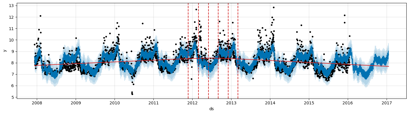
Specifying the locations of the changepoints#
You can manually specify the locations of potential changepoints with the
changepointsargument.Slope changes will then be allowed only at these points, with the same sparse regularization as before.
One could, for instance, create automatically a grid of points.
Then, augment the grid with some specific dates that are known to be likely to have changes.
Alternatively, the changepoints could be entirely limited to a small set of dates, as is done here.
m = Prophet(changepoints=['2014-01-01'])
forecast = m.fit(df).predict(future)
fig = m.plot(forecast, figsize=(14, 4))
a = add_changepoints_to_plot(fig.gca(), m, forecast, threshold=0.01, cp_color='tab:red', trend=True)
14:29:00 - cmdstanpy - INFO - Chain [1] start processing
14:29:00 - cmdstanpy - INFO - Chain [1] done processing
Additive vs. Multiplicative Seasonality#
So far, we have used the default additive Prophet model:
In this formulation, seasonal effects are added to the trend.
This works well when the magnitude of seasonal fluctuations is roughly constant over time, regardless of the overall level of the series.
However, many real-world time series exhibit seasonal patterns that scale with the trend: as the overall level grows, the peaks and troughs also grow proportionally.
In such cases, a multiplicative formulation is more appropriate:
Prophet supports both modes via the seasonality_mode parameter:
seasonality_mode='additive'(default)seasonality_mode='multiplicative'
To illustrate the difference, we use the classic Air Passengers dataset — monthly international airline passenger counts from 1949 to 1960.
# Load the AirPassengers dataset
air_raw = sm.datasets.get_rdataset("AirPassengers", "datasets").data

# AirPassengers records monthly data from Jan 1949 to Dec 1960
air = pd.DataFrame({
    'ds': pd.date_range(start='1949-01-01', periods=len(air_raw), freq='MS'),
    'y': air_raw['value'].values
})

# Train/test split: train on 1949–1957, test on 1958–1960
split_date = pd.Timestamp('1958-01-01')
train_air = air[air['ds'] < split_date].copy()
test_air  = air[air['ds'] >= split_date].copy()
# Plot raw data
fig, ax = plt.subplots(figsize=(12, 4))
ax.plot(air['ds'], air['y'], color='steelblue', lw=1.5)
ax.axvline(split_date, color='red', linestyle='--', alpha=0.7, label='Train / test split')
ax.set_title('Monthly International Air Passengers (1949–1960)')
ax.set_xlabel('Date')
ax.set_ylabel('Passengers (thousands)')
ax.legend()
plt.tight_layout()
plt.show()
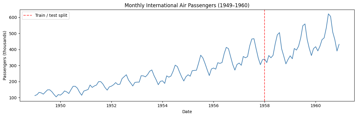
The amplitude of the seasonal swings (summer peaks, winter troughs) clearly grows in proportion to the overall trend level.
This is typical of multiplicative seasonality.
An additive model estimates a single fixed seasonal component calibrated to the average amplitude over the whole series.
As a result, the seasonal effect will be too large at the beginning of the series (where the true amplitude is small) and too small at the end (where the true amplitude is large).
This, will cause data points to fall outside the prediction interval in the later part of the forecast.
# --- Additive model ---
m_add = Prophet(seasonality_mode='additive')
m_add.fit(train_air)

future_air = m_add.make_future_dataframe(periods=len(test_air), freq='MS', include_history=True)
forecast_add = m_add.predict(future_air)

fig = m_add.plot(forecast_add, figsize=(12, 4))
fig.gca().set_title('Prophet — additive seasonality')
plt.tight_layout()
plt.show()
14:29:01 - cmdstanpy - INFO - Chain [1] start processing
14:29:01 - cmdstanpy - INFO - Chain [1] done processing
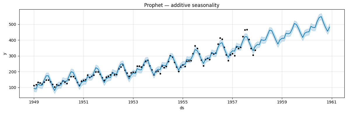
The model uses a seasonal component of fixed size, calibrated to the average amplitude across the whole series.
Because the true amplitude grows over time, the model overestimates early seasonal swings (bands too wide at the start) and underestimates late ones.
The actual data points fall outside the prediction interval toward the end (bands too narrow at the end).
Using
seasonality_mode='multiplicative'tells Prophet to model seasonality as a fraction of the trend, so the seasonal amplitude scales naturally with the series level.
# --- Multiplicative model ---
m_mul = Prophet(seasonality_mode='multiplicative')
m_mul.fit(train_air)

forecast_mul = m_mul.predict(future_air)

fig = m_mul.plot(forecast_mul, figsize=(12, 4))
fig.gca().set_title('Prophet — multiplicative seasonality')
plt.tight_layout()
plt.show()
14:29:01 - cmdstanpy - INFO - Chain [1] start processing
14:29:01 - cmdstanpy - INFO - Chain [1] done processing
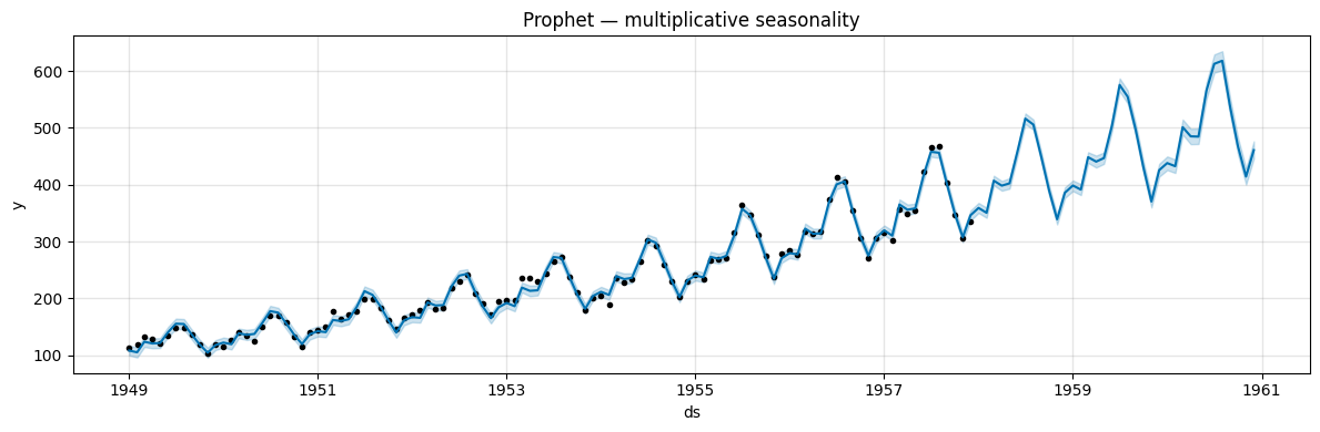
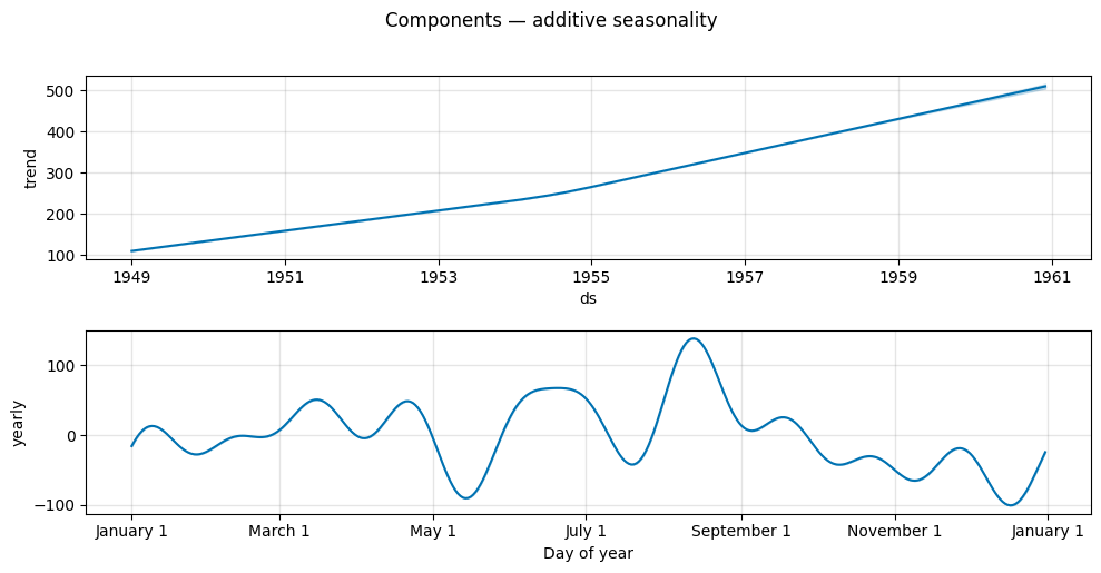
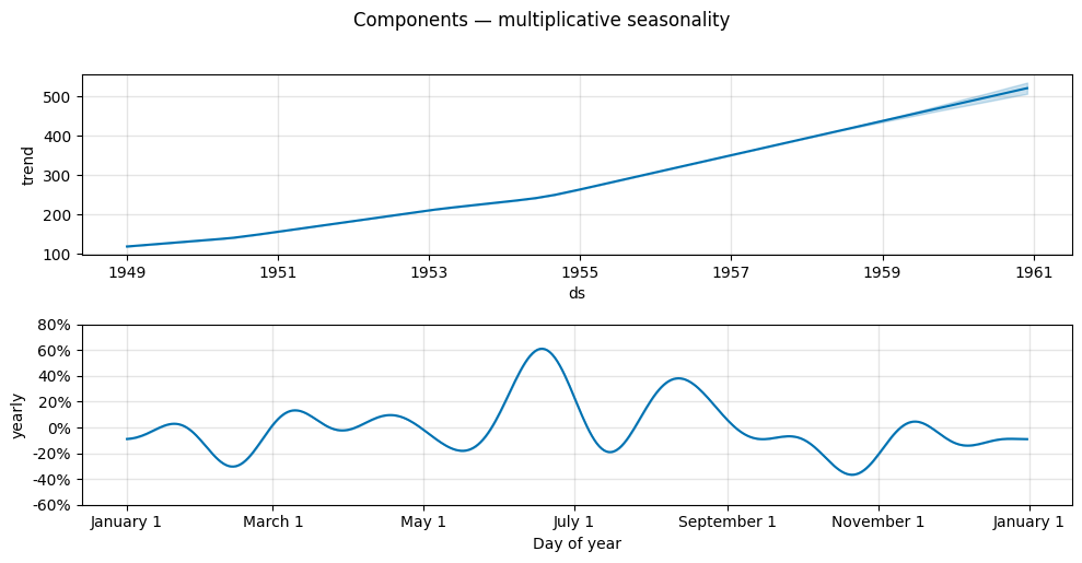
The multiplicative forecast tracks the growing seasonal pattern much more faithfully.
The component plots further illustrate the difference:
in the additive case the yearly seasonality is expressed in the original units (thousands of passengers),
in the multiplicative case it is expressed as a proportion of the trend (a dimensionless fraction).
fig_add = m_add.plot_components(forecast_add, figsize=(10, 5))
fig_add.suptitle('Components — additive seasonality', y=1.02)
plt.tight_layout()
plt.show()
fig_mul = m_mul.plot_components(forecast_mul, figsize=(10, 5))
fig_mul.suptitle('Components — multiplicative seasonality', y=1.02)
plt.tight_layout()
plt.show()
# Quantitative comparison on the test set
y_true = test_air['y'].values
y_pred_add = forecast_add[forecast_add['ds'].isin(test_air['ds'])]['yhat'].values
y_pred_mul = forecast_mul[forecast_mul['ds'].isin(test_air['ds'])]['yhat'].values

rmse_add = np.sqrt(np.mean((y_true - y_pred_add) ** 2))
rmse_mul = np.sqrt(np.mean((y_true - y_pred_mul) ** 2))

print(f"RMSE — Additive model:       {rmse_add:.1f} thousand passengers")
print(f"RMSE — Multiplicative model: {rmse_mul:.1f} thousand passengers")
RMSE — Additive model:       44.8 thousand passengers
RMSE — Multiplicative model: 33.4 thousand passengers
The multiplicative model achieves a substantially lower test-set RMSE, confirming that it is a better fit for data where seasonal amplitude scales with the trend.
Rule of thumb for choosing seasonality mode:
Mode |
When to use |
|---|---|
|
Seasonal amplitude is roughly constant regardless of the trend level |
|
Seasonal amplitude grows or shrinks proportionally with the trend |
A log transformation is an alternative: applying y = log(y) converts multiplicative structure into additive structure, as is done for the Peyton Manning dataset earlier in this notebook.
Tip
Individual seasonality components and regressors can be set to a different mode from the global one.
For example, you can add a custom weekly seasonality that remains additive while the yearly one is multiplicative:
m.add_seasonality(name='weekly', period=7, fourier_order=3, mode='additive').
🛠️ Try it yourself
Apply a log transformation to the Air Passengers series (
train_air['y'] = np.log(train_air['y'])) and refit with the default additive mode.You should get similar quality to the multiplicative model, because the log transform converts multiplicative seasonality into additive.
Summary#
Prophet’s methodology offers a flexible and intuitive approach to time series forecasting.
By decomposing the time series into trend, seasonality, and holiday components, it captures various patterns in the data.
Using Fourier series for seasonality and logistic or piece-wise linear growth for the trend allows Prophet to handle a wide range of forecasting scenarios.
Prophet supports additive (default) and multiplicative seasonality modes. Multiplicative seasonality should be preferred when the amplitude of seasonal fluctuations scales with the trend level, as is common in datasets with exponential growth (e.g. airline passengers, retail sales).
Exercises#
Let’s consider a time series of monthly retail sales index in the Netherlands from 1960 to 1995.
sales = sm.datasets.get_rdataset("DutchSales", "AER").data
print("Raw data:\n------------------\n", sales.head())
Raw data:
------------------
           time  value
0  1960.333333     14
1  1960.416667     13
2  1960.500000     15
3  1960.583333     13
4  1960.666667     13
Do the required preproccesing and convert the data to Prophet format.
Split the data in training and test data, using the first 90% and last 10% of the time series, respectively.
Fit a Prophet model to the data using a linear trend and make a forecast for the period of the test data.
Make the forecast with a model that includes the national holidays.
Adjust the trend by modifying the
changepoint_rangeandchangepoint_prior_scale. For each parameter, try at least two different values from the default ones.Make the forecasts with a model with logistic trend.
Compare the performance of the models obtained at steps 3-6 in terms of MSE and MAPE on the test data.